On-brand, not bland: why Glow Forms nails beauty forms
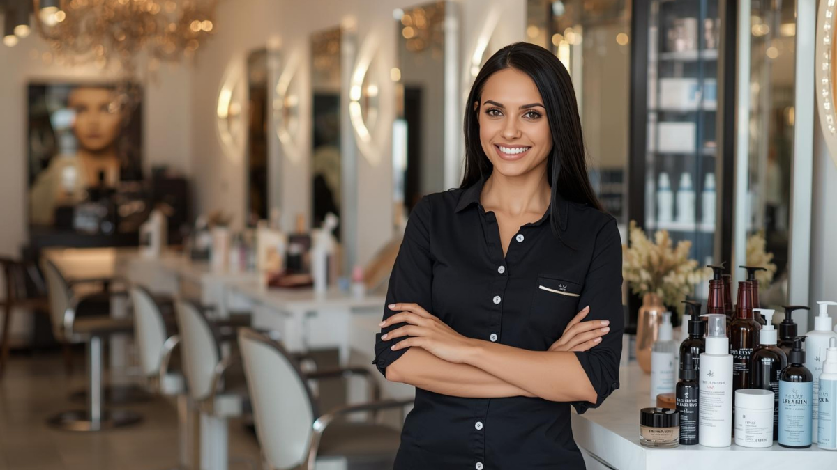
Your studio looks intentional—warm lights, soft colors, crisp shelves. Then the client hits a hospital-looking form. Vibe: gone.
This is where Glow Forms quietly earns its keep. You keep your scheduler. You keep your flow. You just stop handing clients something that feels off-brand and hard to finish.
What “on-brand” actually means (and why it converts)
Your look, not a clipboard. Logo and colors carry through so forms feel like your studio, not a template graveyard.
Beauty language by default. Lashes, brows, facials, peels, PMU—questions that sound like what you actually do.
Short, service-specific forms. Brow lamination ≠ classic facial. One form per service keeps answers accurate and fast.
Readable in salon lighting. Big enough text, strong contrast, obvious buttons. People complete what they can see.
Searchable client records. Every consent, patch test, photo, and signature lands in a tidy timeline you can pull up mid-service.
Here’s the catch: a pretty form with bad structure still stalls. Glow Forms bakes in the tiny things that move people along—progress, required health fields, plain-English errors, and an aftercare summary they can email to themselves.
A tiny Tuesday story
New client books a brow lamination. Your confirmation includes a short, branded consent. She finishes it on her phone the night before. At 9:55 you open her record, see medications and patch-test note, and start on time. No PDF hunt. No “wait, did we ask that?”
Where generic builders usually trip you up
One mega form. Clients bail; staff skim.
Legalese wall. People don’t read drama. Keep the words human.
Photos in the camera roll. They belong in the client record, not your gallery.
Scattered files. Consents as PDFs, notes in email, patch tests on paper—that’s how details get missed.
The 5 minute brand pass (do this once)
Pick your forms by service. Ditch catch-alls.
Set your logo + colors. Keep buttons one bold brand color.
Make health questions required. Allergies, medications, recent treatments—always.
Add “Takes 2 minutes.” People commit when they know the finish line.
Print one QR for the counter. Same link goes in confirmations and reminders.
Proof moments that matter
In-chair recall: Search the name and the entire history appears—intake, consents, patch tests, photos.
Dispute calm: Time-stamped signatures and policy acknowledgments live with the record. No scrambling.
Brand trust: Clients notice when paperwork matches the space. It says, “We’re professional,” without you saying it.
Quick checklist (pin this)
Short, branded forms per service
Required health fields; plain-English copy
Progress + clear errors; obvious buttons
Photos stored in Client Record
All submissions in searchable in Form Activity
Make the form feel like your studio and behave like a guide. That’s the difference between “we collect info” and “we run a tight, beautiful operation.”