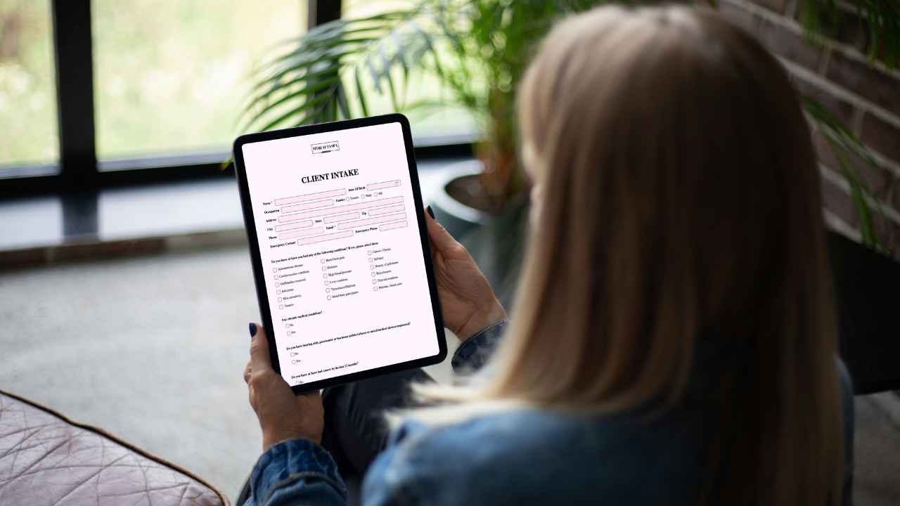
Brand your forms in 5 minutes: fonts, colors, tone, ease-of-use
2 min read
Your form looks like hospital paperwork. Your studio looks like a magazine spread. That mismatch quietly erodes trust—and completion rates.
The fix is quick. One coffee break, four moves.
Pick one font family and stick to it. Make questions comfortably large (around 16px) and helper text smaller (14px). Keep bold for section titles, not every line. If paragraphs run too wide, reduce the width. Save ALL CAPS for headings.
One family, two sizes, one weight
Headings title case; questions sentence case
Avoid thin, low-contrast type
Let a single brand color do the heavy lifting for actions. Keep backgrounds light and text dark so it’s legible in salon lighting. Give gentle feedback as people type—ticks for valid, a short message when something needs fixing.
High contrast (aim ≥4.5:1)
One primary button color used consistently
Clear success/error states
Trade legalese for human. Clients finish what feels friendly and finite.
“Anything we should avoid—allergies, medications, recent treatments?”
“By signing, you confirm you understand the treatment and aftercare.”
Set expectations: “Takes 2 minutes. We read every answer.”
Small choices that make the form effortless.
Short steps with progress (“Step 1 of 3”)
Labels above fields; only critical questions required
Smart inputs (date picker, +1 (xxx) phone mask, dropdowns for repeats)
Plain-English errors (“List any allergies; write ‘none’ if none”)
We changed nothing except bumping question text from 14px to 16px, darkening the primary button, and adding “Takes 2 minutes” at the top. Same questions. Completion went from awkward silence to steady dings. That’s the compounding effect of visible, easy wins.
Too many fonts and colors (collage vibes). Courtroom language that scares readers off. One mega form for every service. Keep it simple, branded, and obvious.
One font family; readable sizes
High-contrast text and buttons
Human tone with time expectations
Progress, labels above fields, minimal required questions
Service-specific branded forms and an aftercare summary emailed to the client
You don’t need a redesign—just small, deliberate choices. Fifteen minutes, and your forms finally look like your studio.

Gifts don’t need bows and big budgets. Use small, thoughtful touches—welcome kits, milestone notes, minis at the mirror—that feel personal and spark rebooks.

The right pre-booking questions save time, prevent mismatched appointments, and help new clients feel clearer, safer, and easier to guide from the start.
GlowForms reminders aren’t “don’t forget your appointment” nags. They’re polite nudges to finish intake forms before clients arrive—so you start on time and sta