QR Codes at the Front Desk: Tips to Triple Completions
3 min read
The clipboard isn’t the problem. The traffic pattern is.
If your QR lives on a dusty poster behind a plant, no one will scan it. Move it 18 inches and you’ll suddenly hear beep… beep… beep as forms roll in.
Here’s where to put QR codes so completion rates jump—without changing your booking or nagging clients.
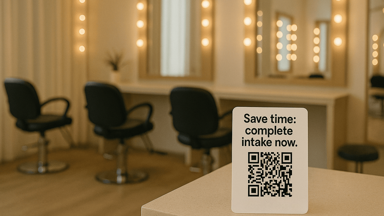
Check-in counter, right of the card terminal.
Clients pause there with a free hand. Add a small stand and you’ve already won.
Mirror at each station, eye level.
While foils process or lashes dry, people read. Keep copy short: “Start your form”.
Door they entered through.
Exits get ignored; entrances don’t. A small decal at handle height is perfect.
Printed receipts & appointment cards.
Tiny QR + short link is your backup when phones stay in pockets.
Waiting chairs & end tables.
A clean tent card that doesn’t scream at them—polite and obvious beats loud and busy.
One-liners that tell the payoff
“Start consent—2 minutes.”
“Save time: complete intake now.”
“Scan → sign → relax.”
Avoid walls of text, exclamation spam, and cutesy riddles. People are here to look good, not solve puzzles.
High contrast: black code on white/light block.
Size: at least 1.25 in (32 mm) square for arm’s-length scans.
Quiet zone: leave white space around the code—no logos touching the dots.
Branded frame: your logo/color on the sign, not inside the code. Keep the code itself boring and scannable.
Unique links per location.
One QR for the counter, another for the mirror, another for the door. You’ll see which spot pulls the most.
Short fallback link.
Print a tiny URL under the code for clients with older phones.
Rotate copy monthly.
If scans dip, test a new headline before you redesign the sign.
We moved a QR from the wall behind reception to a 5x7 stand next to the card reader. Same code, same link. Completion rate went from “two a day” to “six before lunch.” Nothing else changed.
“Before we start, scan this to complete your consent—it takes two minutes.”
If they hesitate: “Camera app works—just point and tap.”
If they prefer: “Here’s the short link.”
Keep it light; keep it the same across the team.
Glossy laminates under bright lights. Reflection kills scans.
Codes at knee level. Nobody’s bending.
Overstuffed posters. QR + headline + brand—done.
One catch-all form. Use service-specific forms; short wins.
Make one QR from your main Glow Forms link (the same code for counter, mirror, and door).
Print three sizes: 5x7 counter stand, 3x3 mirror decal, 2x2 door decal.
Add a short headline to each sign (e.g., “Start consent — 2 minutes”).
Place and test lighting: avoid glare; ensure phones scan at arm’s length.
Train the team (two lines):
“Before we start, scan this to complete your consent—it takes two minutes.”
“Camera app works—just point and tap.”
Measure simply: note last week’s total submissions, place signs, then compare totals next week.
If you want deeper insight later (optional): rotate which spot gets the sign for a few days (door → mirror → counter) and compare weekly totals. This isolates the best placement while keeping the same QR.
Your forms aren’t broken—your placement probably is. Put the code where the pause happens and watch completion rates climb.

Loyal clients do not stay because you are the cheapest. They stay when the experience feels consistent, personal, professional, and worth coming back for.
GlowForms reminders aren’t “don’t forget your appointment” nags. They’re polite nudges to finish intake forms before clients arrive—so you start on time and sta

Clients remember the tiny things: the allergy you noticed, the coffee they like, the follow-up that did not feel copied and pasted.