How Color Psychology Can Level Up Your Salon Branding
3 min read
The fastest way to change how your salon feels isn’t a renovation—it’s your colors.
They nudge mood, shape first impressions, and quietly say “luxury,” “clean,” or “fun” before anyone speaks.
Here’s a simple, no-fluff way to pick colors that work everywhere—from your logo to your Glow Forms.
Calm & clinical-clean: soft neutrals, sage, pale blues.
Use when you want trust, cleanliness, and low-friction decisions.
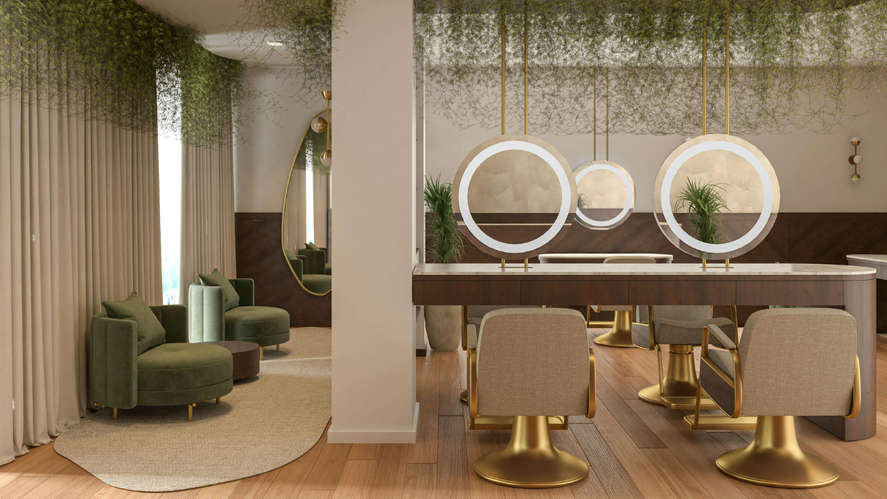
Luxury & high-touch: charcoal, deep plum, emerald, champagne metallics.
Heavier tones + a warm accent read “spa” and “premium.”
Fresh & energetic: coral, rose, goldenrod, teal.
Great for beauty bars and quick services—inviting but not shouty.
Shortcut: pull 1 main brand color, 1 neutral base, 1 accent. That’s it.
Calm clinic: #E9F2F0 (mint-gray), #0B2C2A (deep teal), #FFFFFF (white).
Modern luxury: #1C1B22 (ink), #A58D6F (champagne), #F6F4F2 (warm white).
Playful beauty bar: #FF6B6B (coral), #2EC4B6 (teal), #FFF7EA (cream).
Use the dark color for text/buttons, light for backgrounds, accent for highlights and micro-actions.
1) Your forms (Glow Forms)
Set brand header + buttons to your main color; keep backgrounds light so the form feels short.
Use green/blue for confirmation states (psychologically “safe”), avoid angry reds on success screens.
2) QR codes and signs
Black QR on a high-contrast brand background; headline in your accent: “Takes ~2 minutes.”
Counter, mirror, door—same color, same line. Consistency = trust.
3) Room mood
Pick one wall or décor zone in your brand neutral, not your brightest accent.
Use linens as the “blank canvas” (warm white), then add one small accent piece—tray, jar labels, a plant pot.
4) Photos & before/afters
Shoot against your neutral wall or a lint-free sheet in your palette.
Add a thin color border (your accent) when you assemble proof pics in the client record. Looks tidy, not salesy.
Contrast check (accessibility): body text should be WCAG-friendly. Black/ink on white or warm white wins.
Printer test: does your coral become salmon on a cheap printer? Adjust now, not after 200 flyers.
Night mode: dim your screen—can you still read buttons? If not, darken the text color.
Calm clinic: “Takes ~2 minutes. We read every answer.”
Luxury spa: “Relax—your details are safe and secure.”
Energetic bar: “Quick scan. Quick glow.”
Too many colors. Use 3; let whitespace breathe.
Pale text on pale backgrounds. Pretty, unreadable—darken it.
Random Canva templates. Re-skin them to your palette before posting.
Inconsistent forms. Set colors once in Glow Forms and reuse that template for every intake/consent.
A lash studio swapped candy pink for deep ink + champagne, then matched their Glow Forms buttons and counter QR. Same prices, same services—tips bumped, reviews mentioned “polished,” and first-time no-shows dropped. Color didn’t just decorate; it clarified the brand.
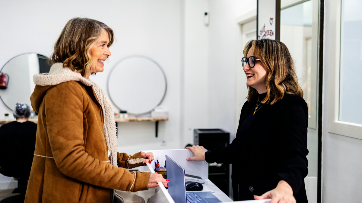
Clients notice more than the treatment itself. A smooth admin experience quietly tells them how organised, professional and detail-aware your business really is
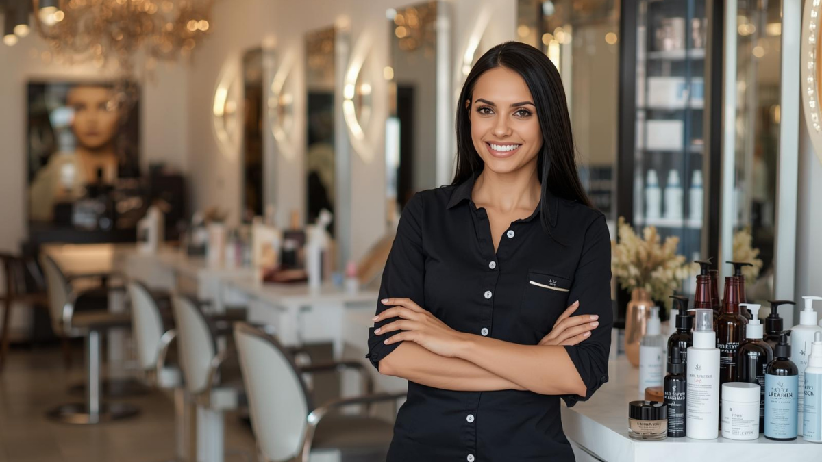
Gifts don’t need bows and big budgets. Use small, thoughtful touches—welcome kits, milestone notes, minis at the mirror—that feel personal and spark rebooks.

The right pre-booking questions save time, prevent mismatched appointments, and help new clients feel clearer, safer, and easier to guide from the start.