Quick Decor Tweaks That Instantly Elevate Your Studio
There’s a specific kind of “off” a studio can have.
Not dirty. Not ugly. Just… unfinished. Like the space is waiting for the real version of itself to arrive. Clients can’t always explain it, but they feel it. And when people don’t feel confident in the space, they get pickier about everything else.
The good news: you don’t need a renovation. You need a handful of quick decisions that make the room look intentional.
Here are the upgrades that give the biggest “oh, this place is nice” impact for the least effort.
Start with the one thing that ruins every photo: clutter
Most studios don’t need more decor. They need fewer visible objects.
Do a two-minute scan from the client’s viewpoint (standing at your door, then sitting in your chair/bed). Anything that looks like:
spare stock piled in a corner
cables trailing across the floor
random boxes under a desk
three half-used bottles lined up like soldiers
…is stealing “premium” from your space.
The fix isn’t “hide everything.” It’s “choose what gets to be seen.”
A simple rule that works: only display what you’d happily photograph. Everything else gets a home.
Tweak 1: Upgrade your lighting, not your furniture
Lighting is the fastest way to make a studio feel expensive.
And I’m not talking about a blinding ring light pointed at a client like an interrogation lamp.
You want warm, soft, consistent light that makes skin look good and makes the room feel calm.
What changes everything:
swap harsh white bulbs for warmer ones (consistent across the room)
add one soft lamp in reception or a corner that feels “dead”
if you have a treatment room, use lighting you can dim for comfort
If your studio has great lighting, clients look better in the mirror. And that’s basically a cheat code.
Tweak 2: One big mirror moment
A mirror isn’t just functional. It’s theatre.
When someone finishes a treatment, the mirror is where they decide:
do I love this?
do I trust her?
do I rebook?
Make the mirror area feel intentional:
clean, streak-free mirror (obvious, but rare)
one small surface for their phone/bag
a single styling item (not a pile) like a tray, vase, or product stand
If the mirror corner looks “designed,” the result feels more premium before you’ve said a word.
Tweak 3: A “signature” shelf that looks curated, not stocked
Clients love a “this is what we use” moment. They don’t love feeling like they’re in a storeroom.
Pick one shelf or wall area and style it like a display:
a few products you actually use (front-facing, spaced)
one plant or sculptural object
one framed print or clean sign
Leave air between objects. Space is what makes things look expensive.
Tweak 4: Swap the tiny prints for one larger statement
A cluster of small frames can look cute… or like you’ve raided a charity shop at speed.
One larger piece often looks calmer and more grown-up:
one big print
one clean brand sign
one textured wall piece
It reduces visual noise instantly.
Tweak 5: Fix what clients touch
If you want the room to feel elevated, focus on texture.
Clients judge quality with their hands:
the towel
the blanket
the robe
the headband
the chair fabric
If your towels feel thin or your blanket feels scratchy, the space stops feeling luxe no matter how pretty the wall art is.
This is the best “invisible upgrade” you can make: make the touch points feel good.
Tweak 6: Hide cables like your reputation depends on it
Nothing kills a premium studio faster than visible wires.
You don’t notice them because you live there. Clients do.
Do a quick cable audit:
tuck them behind furniture
use simple clips or covers
keep chargers in one hidden spot, not everywhere
It’s a tiny effort with a huge “professional” payoff.
Tweak 7: Create one “photo-ready” corner
You don’t need your entire studio to be Instagram-ready. You need one corner that’s always ready.
Pick a spot with good light and design it like a backdrop:
clean wall or soft neutral texture
a small plant or minimal decor
consistent lighting
That’s where you’ll take:
after photos
team snaps
client permission shots
product features
When that corner is always ready, you post more, faster, with less effort. And your content looks consistent.
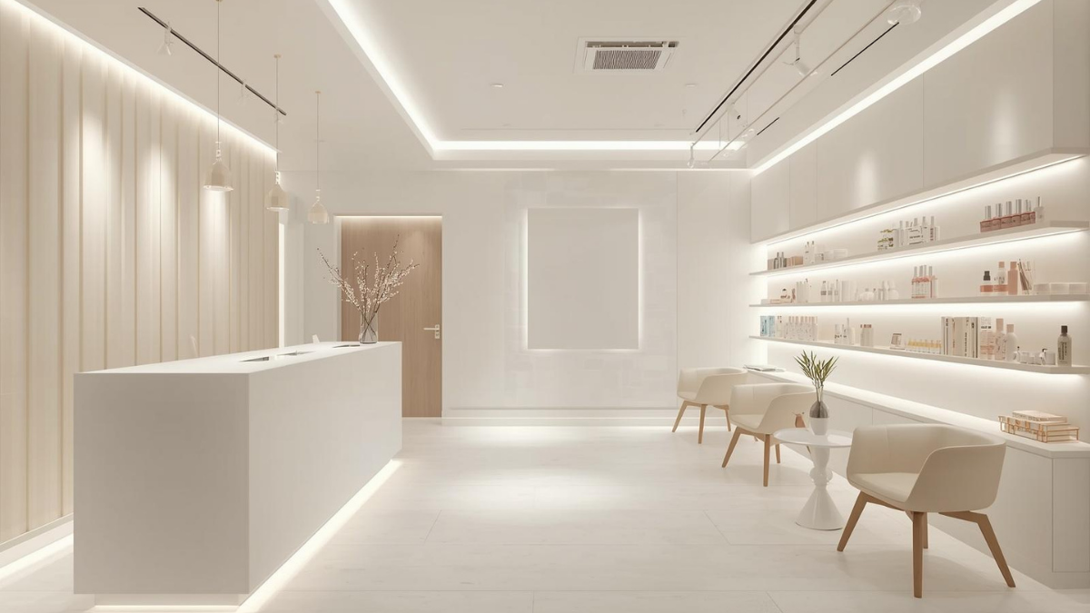
Tweak 8: Make your reception feel like a welcome, not a checkout
Reception should feel like the start of an experience, not a transaction.
Two small moves:
clear the countertop (keep it mostly empty)
add one welcoming detail: a small tray, a vase, a clean sign, a scent that’s subtle
If the first thing a client sees is clutter and cards and random paperwork, they arrive stressed. If it’s calm, they arrive calm.
Tweak 9: Make signage clean and minimal
Signage matters. Not the amount of signage—the quality.
A handwritten sign taped to the wall screams “temporary,” even if it’s been there for 18 months.
Upgrade signs for:
WiFi
booking QR
policies (kept short)
Keep them consistent in font and style. The studio instantly feels more “brand.”
Tweak 10: The scent baseline (quiet, not perfumed)
If your studio smells consistent, it feels consistent.
This isn’t about blasting fragrance. It’s about removing the weird smells and adding a subtle, clean baseline.
One light scent in reception can do a lot—just keep treatment rooms gentler for sensitive clients.
A quick story to end on
A small studio I visited didn’t change its furniture, didn’t repaint, didn’t “rebrand.”
They did three things:
swapped lighting
removed clutter from sight lines
styled one shelf with space between items
It looked like a different business. Same room. Different feeling.
That’s what these tweaks do. They don’t just make the place pretty. They make it feel intentional.
And clients notice intentional.